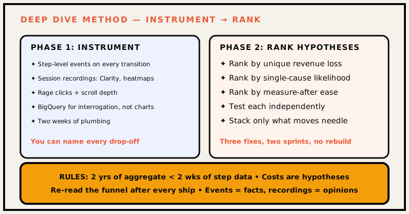
A deep dive that changes metrics has two phases. First, instrument the funnel until you can name each drop-off. Second, form ranked hypotheses. At Sierra, 480K sessions became three fixable problems in two weeks — because we never diagnosed an aggregate, only a funnel.
"Cart abandonment is too high." That sentence sat in our metrics review for months, and everyone nodded, and nothing moved — because an aggregate number is unanswerable. When we finally stepped through 480K sessions properly, "abandonment" turned out to be three completely different problems wearing one trench coat. The failure happens four steps before the diagnosis: no events, no recordings, no funnel, no ranked hypotheses — and then a hunch gets a roadmap slot.
Phase 1 — Instrument the funnel
You cannot fix a funnel you cannot step through. The deep dive starts with one ask: name every step.
Install step-level events on the surface you care about (view → engage → convert or checkout view → shipping → payment → purchase)
Layer on session recordings: heatmaps, rage clicks, scroll depth
Put the output in BigQuery so you can interrogate it, not just chart it
Only when you can answer "which step loses the most, and which looks like a single cause" do conclusions become credible.
The shape of the events
An event-per-step pattern looks roughly like this — the exact fields vary by funnel, but the principle doesn't:
Every step gets an event. No "checkout started" aggregate — you need the staircase.
The Clarity setup
Microsoft Clarity is free and unsampled, which matters more than any premium feature:
Recordings on for 100% of sessions (sampling kills the rare but critical paths)
Heatmaps on every checkout step URL
Rage-click detection on form fields, buttons, promo inputs
Dead-click mapping — clicks on non-interactive elements reveal broken expectations
The BigQuery schema
Don't just chart in GA4. Stream the raw events to BigQuery via the GA4 BigQuery export so you can interrogate them directly — a drop-off-by-step query, segmented by device, looks roughly like this:
-- Illustrative — drop-off by step, segmented by device
SELECT
  step,
  device.category,
  COUNT(DISTINCT user_pseudo_id) as users,
  COUNT(*) as events,
  COUNT(DISTINCT user_pseudo_id) / LAG(COUNT(DISTINCT user_pseudo_id)) OVER (ORDER BY step_index) as dropoff_rate
FROM `project.analytics_events`
WHERE event_name IN ('checkout_step', 'purchase')
GROUP BY step, device.category, step_index
ORDER BY step_index;
SQL like this is the deep dive. The dashboard is the summary.
Phase 2 — Ranked hypotheses
Aggregate data lies politely; a funnel stops lying. Take the event tables and rank drop-offs:
Rank
What you're testing
1
The step with the biggest unique loss
2
The step most likely to be one cause
3
The step that is easiest to measure after
Phase 1: instrument. Phase 2: rank. The funnel names the problem; the ranking picks the fix.
At Sierra this drill surfaced three distinct checkout problems — shipping surprise, promo rage-click, payment dead-end — that one aggregate percentage had been hiding. Each got an independent hypothesis, an independent fix, and an independent measurement window, so when the number moved we knew exactly which change owned it. The full breakdown — what each problem looked like in the session recordings, what shipped, and the before/after numbers (73.1% → 53.9% abandonment, +47% mobile CVR, +49% checkout completion) — is in the checkout teardown.
The rule that tells this apart from guesswork
Two years of aggregate is weaker than two weeks of steps; instrumentation expands signal, not volume.
Cost estimates are hypotheses too. Just because a fix is one-line doesn't make it the winner.
Re-read the funnel after shipping; you only learn from the same instrument.
Post-mortem notes
"Cart abandonment" was the trap; the funnel named three different things.
Events are facts, recordings are opinions; trust the ones you can replay.