Category pages look like static shelves; the data showed they were a two-step conversation. At Sierra we replaced commodity grids with story-driven journeys in a 4-week sprint, backed by GA4 custom events and Clarity heatmaps. Session-to-PDP click +17%, qualified leads +34%, bounce −16%, ATC +27% — on 1.1M BigQuery events, same traffic.
Every category page in e-commerce is a "am I in the right store?" moment. Most stores treat them as static shelves and leave the visitor to figure out intent alone. The data said something more interesting: the click happened, the click did nothing.
The moment I stopped counting clicks
The store's category pages got traffic. The products under them didn't get visits. It took exactly two weeks of GA4 custom events and Clarity scroll maps to see it — but once we had:
Microsoft Clarity heatmaps + scroll depth on every category template.
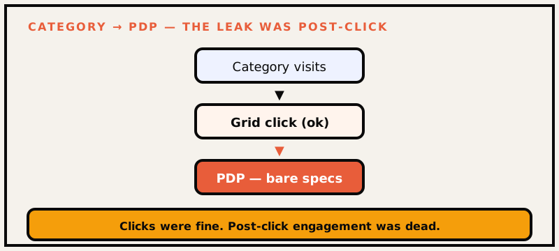
The "quiet insight" turned out to be not quiet at all. Category clicks were big, but PDP engagement after the click was weak. Visitors clicked through a grid, landed on a product, and bounced off the page almost immediately. The funnel wasn't broken at the top — the storytelling was the leak.
Traffic arrived; the click-through died on the product page. The leak wasn't top-of-funnel — it was the story.
What the session tapes actually showed
We watched 40+ category sessions back to back. The pattern was consistent:
A visitor clicked a product from the grid.
The product page loaded a bare spec table: dimensions, materials, price.
The visitor looked for why this fits my space, didn't find it, and backed out within seconds.
The store was selling furniture without saying who it's for. The redesign became a single question: how do we tell the visitor which product belongs to their life before they have to ask?
The category-page system we shipped
Each redesigned module balanced four layers, in order of importance:
A guiding first section — why choose this category was layout, not a paragraph. The answer to "is this for me" appeared in the first screen.
Trust signals up top — guarantees, shipping windows, live ratings near first glance, not buried at the footer.
Intent-filter scaffolding — the user narrows by aspiration ("feed a family of 6") not by schema variables ("seats: 6"). People don't search dining tables by attribute; they search by occasion.
Editorial PDP traction — the grid became teasers. Each cell teased the product story instead of a static image.
How we measured it
This was the part I'd defend most. We didn't launch "the new design" — each module shipped under a controlled rollout, with week-over-week comparisons against the same traffic baseline. If a module didn't move its KPI, it didn't stay.
Three things made the measurement honest:
A fixed baseline. 1.1 million BigQuery events across the category templates, frozen before the first module shipped. No cherry-picked week, no "one lucky day."
Same traffic, no ad changes. The budget didn't move. Any delta in behavior is behavior, not spend.
KPI-at-the-cadence-of-decision. We watched the same five metrics for however long a change took to become boring — bounce, PDP click, ATC, qualified lead, session dwell.
The week-by-week of a 4-week sprint
Week 1 — instrument and freeze. GA4 events + Clarity heatmaps go live on every category template. Zero design decisions until the first read of where people stop.
Week 2 — build story first, grid second. The leading question section, trust signals, and intent filters ship to one storefront category.
Week 3 — iterate against the tape. Compare that one category against the baseline; keep or kill the modules.
Week 4 — extend, then hold. Roll the winning modules across the other templates and freeze again.
The discipline that got us to +34% qualified leads wasn't a bolder design. It was refusing to ship "the new design" without a control group.
The numbers
Metric
Δ
Session→PDP click
+17%
Qualified leads
+34%
Bounce rate
−16%
Add-to-cart rate
+27%
Events analyzed
1.1M (BigQuery)
Qualified leads mattered more than raw traffic to the business — the store's lead form feeds its sales floor, so +34% qualified meant +34% on the pipeline, not +34% on a vanity count. (That same form gets its own teardown in the +124% lead-form fix.)
What I'd do differently
Ship the editorial layer first. The story section drove more than the grid styling. In hindsight the order of builds was backwards — story before structure would've compounded the wins faster.
Bank more session-to-PDP variants. We had one strong winner. A second iteration would've told us whether the win was the story or the trust signals, and run sooner.
If your category pages don't convert, start here
Adapt the exact recipe, sized to your store:
Instrument for two weeks before you design. GA4 events for category view → PDP click → ATC → lead; Clarity scroll + click maps. Freeze the baseline.
Answer "who is this for" on the first screen. Not with copy — with layout. One leading section, trust signals (guarantee, shipping window, rating) above the fold.
Replace attribute filters with intent filters. People don't search dining tables by "seat count"; they search by occasion. Offer "feed a family of six," not "seats: 6."
Make the grid a teaser. Each cell should hint the product story — why it fits a space — so the PDP click leads somewhere.
Then ride one category for two weeks against your frozen baseline before touching the rest. If the module doesn't move all five KPIs, it doesn't ship everywhere.
The tell a good category page has
You know a category page is doing its job when a visitor can answer three questions without scrolling much: Is this store for me? Is this product for my space? What happens if I proceed? The old grids answered none of the three and blamed traffic. The redesigned modules answered one within the first viewport — which is why bounce fell 16 points and qualified leads rose 34.
That's the whole principle, compressed: a category page is not a shelf. It's a first conversation. (Baymard's e-commerce UX research makes the same case with 130,000+ hours of testing behind it.)