Lead forms leak at one field, not from length. A hidden phone-format rule drove 23% of drop-offs. Mask + inline validation + intent labels lifted submissions 124% in 28 days — with more fields, not fewer.
The marketing ask was the sane one: more traffic. The team wanted a bigger top of funnel. The data said we'd been paying for traffic and then spilling a big slice of it on the walk to the callback — a form with a 23% leak at one field is a bigger lever than any ad-budget increase. But I had to prove the leak existed before I could ask for the fix.
The 2.14% form nobody could see
Our lead-capture form converted at 2.14%. Nobody argued it was good. The problem was that the number was the only thing anybody could see — one completion rate, and a whole roster of theories about what to do with it.
The theories were the enemy.
"It's too long." (The form wasn't long, but the phrase had staying power.)
"The latency is bad." (True — client-side fields took 3–5 seconds to initialize on typical connections.)
"The labels are confusing." (Also plausible — but nobody could prove it.)
Every one of those was a snipe at the aggregate. A real diagnosis needs to know: at which exact field does the flow die?
Field-by-field instrumentation — the recipe
Same play as the checkout, two levels down. Where the checkout got an event per step, this got an event per field:
GA4 custom events per interaction — field focus, first touch, error, submit attempt.
Microsoft Clarity recordings + binge-click heatmaps — 50+ complete form sessions across desktop and mobile.
A field-by-field funnel built from first touch to final submit.
The funnel is the entire product. Without it you can't even name the leak — with it you can walk up to a designer and point at a phone input on a Monday afternoon.
The moment the layout turned
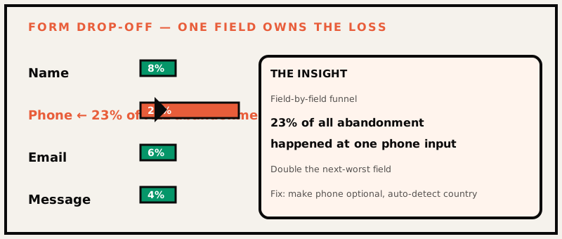
One field owned 23% of the entire form's abandonment — double the next-worst offender.
One pattern appeared in every single session. Users reached the phone field, typed, got nothing — and left.
The culprit was a phone number format check expecting +1 (555) 000-0000, on a desktop keyboard, failing if the input didn't match exactly. No hint. No formatting. No inline feedback. Type a digit the parser didn't like and the field stayed red — if it gave any signal at all. Then the tab closes.
23% of all abandonment, from one restriction — more than double the next-worst field. The team had spent weeks guessing "too long." The sessions said "the phone field."
The three fixes we shipped (plus the real one)
Fix
What we did
Why it worked
Format hint
Visible masked input + placeholder before the first touch
Users learned the expected format without an error
Inline validation
Accept the moment the input becomes valid
Errors never wait for a submit failure
Contextual microcopy
Case-specific labels ("Work phone" vs "Any phone")
Users understood intent instead of bouncing
But the deeper fix wasn't a field fix. The form shipped to every visitor with one shape, and shape was part of the leak too. We rebuilt it into category-specific modules (Material 3 components + the latency cuts) so a Custom Furniture visitor got the exact fields a custom-quote visitor needs. Same form, different face, zero extra load.
The numbers
Metric
Before
After
Lead submissions
baseline
+124%
Mobile completion time
baseline
−41%
Rage clicks
baseline
−68%
Why the fix worked — and why "shorter form" never would have
The hard part of this project was that every instinct pointed the wrong way. "Shorten the form" is the classic advice, and it's usually wrong — here's why we know:
The leak wasn't length. Users reached the phone field — deep in the form — and left there. Shortening wouldn't have removed the field that mattered; it would just have moved the leak closer to the top.
Latency set the tone. Client-side fields took 3–5 seconds to initialize on typical connections. On mobile that felt like the form was broken before the user even looked at it. Fast initialization quietly removed the "this is slow, this is broken" walk-away before a user ever typed.
Expectation beats both. A user who can see the required format in a placeholder, and gets live "yes, that's right" feedback the moment it's valid, doesn't need to error at all. The form stopped producing rejection moments.
That last point is the one worth stealing. Good form design is mostly removing the moment of rejection. Every field that can be validated inline should be — web.dev's form best practices cover the mechanics. Every format that can be shown ahead of typing should be. If you never show a user a red field, you never give them a reason to walk away.
What changes when you ship this on mobile (the real test)
Desktop was the easy half. On mobile it was stark:
The phone field popped a numeric keypad that had no digit-formatted guide — users were guessing the mask the parser wanted.
Form width and focus states didn't match the brand's storefront; the form read as "generic template," not part of the site.
Submission after latency was worse on mobile than desktop — and the rage-click on a dead field meant that user never came back.
The module rework bundled mobile-specific copy and the Material 3 components. The −41% mobile completion-time metric you see in the table came largely from the field logic, not the CSS.
Why this was defensible in a room of skeptics
The move that made this easy to defend: field-level funnels make the fix ownable. When a designer asked "prove the phone field was it," the answer wasn't a theory — it was a row in a table and 30 seconds of shared Clarity playback. Every form project should be presented that way: as a ladder with one rung shown red, and the fix mapped to the exact rung.
If your form leaks and you don't know why, this month
Install field-level events — focus, error, submit. Run two weeks, export the funnel.
Watch three real mobile sessions. You'll see the leak in one lunch break.
Remove the rejections, not the length. Placeholder masks, inline validation, specific microcopy. Ship, then re-measure the same funnel.
What I'd do differently
Instrument before you guess. We burned a week on "the form is too long" because it was a pleasant hypothesis. The field-level events were built in week two, and they'd have saved us the week.
Watch three real mobile sessions early. Two weeks of Clarity told us more than three months of dashboards — because a dashboard can't show a phone input failing in silence.
Full spec and code-adjacent details: the lead form case study. And if you've read the checkout teardown — the same measure-before-you-fix play at a different scale — this is the field-level version: checkout abandonment.
Frequently asked questions
What's the most common reason a lead form loses submissions?+
A single restrictive field. Ours was a phone-format check that silently failed — 23% of drop-offs, double the next-worst field.
Should you shorten your lead form to convert more?+
Length is a symptom, not the cause. Inline validation, format hints and case-specific microcopy beat removing fields.
What tools reveal form drop-offs?+
GA4 custom events for a field-by-field funnel, Microsoft Clarity for rage clicks and recordings, then a prioritized fix list.
How long to see the +124% lift?+
28 days after instrumentation — 14 days to measure, 14 to ship and validate.